Font size problem

Use this only for testing your signatures, avatars, things like that.

Moderators: Thorn Blackstone, Halaster Blackcloak

Post Reply
User avatar
Halaster Blackcloak
Lord of Undermountain
Posts: 3955
Joined: Wed Mar 14, 2007 12:47 am
Location: Undermountain
Contact:

Font size problem

Post by Halaster Blackcloak »

I swear, I need a real techy to manage this stuff. :evil:

Ok, problem with the font size. I've tried changing all sorts of font size settings, to no avail! :evil: They simply don't change! :evil:

Here's a block of text written without defining it (ie I typed it without clicking any sizes, etc):

Dragon #66 - Why are elves unable to become rangers? Why do half-elves have limited ranger abilities? Shouldn’t sylvan elves have ranger-like talents? How are certain of the elven deities able to have ranger fighting abilities if their subjects do not?

Here is the same text if I use the font size option and choose "normal":

Dragon #66 Why are elves unable to become rangers? Why do half-elves have limited ranger abilities? Shouldn’t sylvan elves have ranger-like talents? How are certain of the elven deities able to have ranger fighting abilities if their subjects do not?

Shouldn't they be the same size? How do I set it so that it automatically types the size that the second post it written in?

Or is the larger sized text above better on the eyes?
The Back In Print Project - Where AD&D Lives Forever!

Image
User avatar
Varl
Scribe of Tomes
Scribe of Tomes
Posts: 313
Joined: Wed Mar 14, 2007 7:55 am
Location: Mount Vernon, Washington

Post by Varl »

I'm not sure I'd worry about text sizing Hal. Keep the code defaults, because most people that run Firefox (not sure about IE) have the option with Ctrl +/- to adjust the text size to whatever they want, so I'd leave it at default. Some testing follows, so ignore:

Test test test test test

Test test test test test

Test test test test test

Test test test test test

Test test test test test

Those are the 5 sizings for text.

Edit: It looks like the default reply text I'm typing here is not one of the 5 above, that's for sure, but again, regardless of the size of the text on the site, each user can custom set the text sizes with Control Plus and Control Minus.
Unther
Scribe of Tomes
Scribe of Tomes
Posts: 22
Joined: Wed Mar 14, 2007 10:59 am

Post by Unther »

1
2
3
4
5
6
7
8
9
10
11
12
13
14
15
16
17
18
User avatar
Halaster Blackcloak
Lord of Undermountain
Posts: 3955
Joined: Wed Mar 14, 2007 12:47 am
Location: Undermountain
Contact:

Post by Halaster Blackcloak »

So the font size is working fine? It doesn't seem too big? I think Verdana would be easier on the eyes though. Also, here's a screen shot of the site now, then one that I doctored in Photoshop to sorta simulate some of what I'm trying to do:

Image

Image
The Back In Print Project - Where AD&D Lives Forever!

Image
User avatar
Halaster Blackcloak
Lord of Undermountain
Posts: 3955
Joined: Wed Mar 14, 2007 12:47 am
Location: Undermountain
Contact:

Post by Halaster Blackcloak »

If you sign in at the Acaeum and choose the Chronicles template there, it seems the posts use a Verdana style font that looks much better than whatever font the posts here generate. I think the sans-serif Verdana font works better with the complex background. So the trick is, how to change it? :?
The Back In Print Project - Where AD&D Lives Forever!

Image
User avatar
Varl
Scribe of Tomes
Scribe of Tomes
Posts: 313
Joined: Wed Mar 14, 2007 7:55 am
Location: Mount Vernon, Washington

Post by Varl »

Try this. I know you're not a techie Hal, if you can get into the code of the page, you might try some of these tips:

http://www.htmlgoodies.com/tutorials/co ... hp/3479011
User avatar
Halaster Blackcloak
Lord of Undermountain
Posts: 3955
Joined: Wed Mar 14, 2007 12:47 am
Location: Undermountain
Contact:

Post by Halaster Blackcloak »

Thanks Varl! :wink:

Well if you noticed, I managed to change the link color. The yellow color was almost invisible on the light parchment background. This php/CSS stuff is whacky and stupid. The setting that changes the line color also changes the color of the names on the main menu. Why would one setting cover different functions? That's like the horn on a car also activating the windshield wipers. I'd like to find whoever invented this software and slap his mother for not raising him with common sense! :evil:

Does the blue look too intense? It certainly doesn't match the theme. We want links to stand out, but... :?
The Back In Print Project - Where AD&D Lives Forever!

Image
User avatar
Halaster Blackcloak
Lord of Undermountain
Posts: 3955
Joined: Wed Mar 14, 2007 12:47 am
Location: Undermountain
Contact:

Post by Halaster Blackcloak »

Well, I darkened the lighter parchment so that we could use the brighter yellow. It stands out and it matches. Man, matching colors to parchment is a PITA! :evil:

I think the yellow works for now, unless anyone thinks it's too hard on the eyes.
The Back In Print Project - Where AD&D Lives Forever!

Image
User avatar
Varl
Scribe of Tomes
Scribe of Tomes
Posts: 313
Joined: Wed Mar 14, 2007 7:55 am
Location: Mount Vernon, Washington

Post by Varl »

The new yellow is much easier to see than the previous color. My friend is going to stop by and check out your site for you Hal. He's pretty good with web design, but he's only used UBB Threads and Simple Machines Forums, but website design and development is pretty much the same when it comes to the scripts. So hopefully, he'll be able to diagnose the issues on this site for you. :)
User avatar
Halaster Blackcloak
Lord of Undermountain
Posts: 3955
Joined: Wed Mar 14, 2007 12:47 am
Location: Undermountain
Contact:

Post by Halaster Blackcloak »

Excellent! Thanks Varl! Hopefully I can get Unther set up with access so he can also play with it and troubleshoot it. I figure out a lot of things today, but some issues are wooooshhhh! Over my head! :oops:

SimplerMachines...that's some good software. I like how ADNDCampaigns.com works, and that's what Zherbus is running it on.
The Back In Print Project - Where AD&D Lives Forever!

Image
User avatar
Varl
Scribe of Tomes
Scribe of Tomes
Posts: 313
Joined: Wed Mar 14, 2007 7:55 am
Location: Mount Vernon, Washington

Post by Varl »

Halaster Blackcloak wrote:Excellent! Thanks Varl! Hopefully I can get Unther set up with access so he can also play with it and troubleshoot it. I figure out a lot of things today, but some issues are wooooshhhh! Over my head! :oops:

SimplerMachines...that's some good software. I like how ADNDCampaigns.com works, and that's what Zherbus is running it on.
Yeah, Simple Machines is so much better according to Don, and the support is really good too from what I hear.
User avatar
Halaster Blackcloak
Lord of Undermountain
Posts: 3955
Joined: Wed Mar 14, 2007 12:47 am
Location: Undermountain
Contact:

Post by Halaster Blackcloak »

Well this is freaky. The "default" text size is not one of the font sizes listed in the drop down menu. It's actually defaulted at size 16. :shock: In other words, if you post without choosing a font size, it places it at 16. Weird. I changed the font settings in the admin panel, but to no avail. :evil:

Loks like Unther is going to have to tweak the css sheet settings or whatever. But first, which font size do we want for the default (ie the font size that posts appear in if you do not choose a font from the drop down menu)? Here are samples with the sizes listed:
______________________

SIZE 12

1980s: Adventures were selling mostly between 50,000 and 150,000 units. A few of them (the ones we all know by name) exceeded that. I think White Plume Mountain was around 175,000.

SIZE 13

1980s: Adventures were selling mostly between 50,000 and 150,000 units. A few of them (the ones we all know by name) exceeded that. I think White Plume Mountain was around 175,000.

SIZE 14

1980s: Adventures were selling mostly between 50,000 and 150,000 units. A few of them (the ones we all know by name) exceeded that. I think White Plume Mountain was around 175,000.

SIZE 15

1980s: Adventures were selling mostly between 50,000 and 150,000 units. A few of them (the ones we all know by name) exceeded that. I think White Plume Mountain was around 175,000.

SIZE 16 (the current default)

1980s: Adventures were selling mostly between 50,000 and 150,000 units. A few of them (the ones we all know by name) exceeded that. I think White Plume Mountain was around 175,000.
______________________

I think 16 is too large, it actually distorts the font. For my eyes, size 15 is perfect. Or perhaps even 14. Saves space, but still pretty decent. What do the rest of you think?

Also, which font do we want to use for messages? Do we want to go with a clean one like Verdana (sans serif type)? Or perhaps a serif type like courier?

Here's a copy of various fonts we can use:

Image

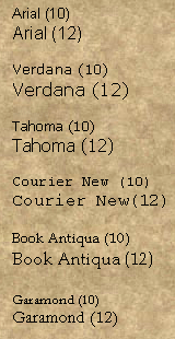
The top 3 are sans-serif (ie no hangy things off the edges), and the bottom 3 are serif (fancy). I think the cleanest and easiest on the eyes (for forum posts) are Verdana 10 and Tahoma 10. If we go with a serif font, I think Book Antiqua 10 is the best choice.

Whatcha'all think? :)
The Back In Print Project - Where AD&D Lives Forever!

Image
Unther
Scribe of Tomes
Scribe of Tomes
Posts: 22
Joined: Wed Mar 14, 2007 10:59 am

Post by Unther »

Ok, as a note, all the fonts are defined in pixel size, not pt. size...

This means how they appear is dependent on the resolution and dpi of the display. It has advantages if pixelised images are in use as it ensures that images and text always line up, but it creates problems on high dpi displays. (I personally like the 16px, but would prefer the use of 12pt fonts, which my system gets right for itself.) In general, a sensible medium is the best solution, and letting people use font size overrides is my preferred approach. (IE6 and Firefox are both capable of overriding stylesheets, as is any other modern browser.)
User avatar
Halaster Blackcloak
Lord of Undermountain
Posts: 3955
Joined: Wed Mar 14, 2007 12:47 am
Location: Undermountain
Contact:

Post by Halaster Blackcloak »

Now I'm really confused. :?

When it says "size 16" on the forum, that's 16 pixels and not 16 pt.?

In that case, we need to go by the pizel size when sizing the forum fonts?
The Back In Print Project - Where AD&D Lives Forever!

Image
User avatar
Halaster Blackcloak
Lord of Undermountain
Posts: 3955
Joined: Wed Mar 14, 2007 12:47 am
Location: Undermountain
Contact:

Post by Halaster Blackcloak »

Unther? Any response on the font size?
The Back In Print Project - Where AD&D Lives Forever!

Image
LeSong
Dungeon Delver
Dungeon Delver
Posts: 24
Joined: Wed Mar 14, 2007 7:55 am
Location: IL, CA, MO, NC

Post by LeSong »

This is a smaller excerpt from mvps.org (the second best site ever); the whole piece is about a page and half, if you would like to see it I can email it to whomsoever.

One inch (2.54 centimeters) can be broken down into points and picas, as follows:

One inch = 72 points

One inch = 6 picas (72 points ÷ 6 picas = 12 points to 1 pica)

It seems simple enough when you use these measurements to determine spacing between lines (leading) – you can easily use a point scale or a pica scale to measure and verify the number of points of spacing between lines on your hard copy. It can get confusing, though, when you look at font size, which is also described in points (see the “E”s in the previous margin graphic). [The illustration shows the letter E at 11, 12, 14, 18, and 24 points.] You might say to yourself, “That 12-point E doesn't look as if it's 12 points tall!” And you'd be right – it's not. Font sizes are measured completely differently than leading, even though they're both specified in points, and the only way you can verify font size on your hard copy is by measuring it against the designated sizes that you'll find on an E-scale. Most art-supply stores carry precision rules, which combine a pica scale, a point scale, and an E-scale in one handy tool.

If you want more info, let me now either way a good resource is in the Microsoft Publisher 97 Companion; section titled the “The Look of Words”.
Post Reply